
Starling
Starling Bank is a digital challenger bank based in the UK, which focuses on current and business account products.
The Problem
Although Starling offers some very useful and easy to understand spending insights, it does not provide a specific budget feature where users can set their own budget (with customisable pay dates) and with the option to set budgets by categories. Currently there is a set list of categories so users are also missing the flexibility to create their own bespoke categories.
Project goals
Create a new budgeting feature for the mobile app that would enhance the user experience of Starling’s customers
Help Starling keep pace with its feature-rich competitors Monzo and Revolut
Widen the scope of Starling’s potential customer base by capturing those requiring a comprehensive budgeting tool
Design process
-
Empathise
Competitive analysis
User interviews / Survey
Persona
-
Define
Site map
Task flow
User flow
-
Ideate
Wireframes
High fidelity UI
-
Test & Iterate
Usability testing
Affinity map
Iterations
Empathise
Competitive analysis
Both digital bank and budgeting apps were analysed to gain an understanding of what users value most in budgeting tools and what frustrations they are facing with existing solutions.
Starling’s main competitors are Revolut and Monzo who have huge market share and a similar product offering. They both offer a built-in budgeting tool which is considered an important feature by the users.
However a number of users have raised issues with how these features work with the information not clear to interpret and lacking options in the budget setup such as irregular pay day schedules.
These pain points can be addressed in Starling’s new feature to help give them an edge over their competition.
Research findings
User interviews and a research survey were conducted to gain further insight into the target users spending and savings habits, in addition to identifying important features for the budgeting solution.
The participants were a mix of existing Starling bank app users and those not banking with Starling.
Key findings:
100% of respondents would be open to using a digital budgeting tool if they don’t already.
80% thought they had room to improve their budgeting and could save more.
Users want a simple tool with minimal data entry and low maintenance effort.
User persona
The following persona was created after synthesising the feedback from the user interviews and survey, helping to empathise further with the user and appreciate their key goals, needs, motivations and frustrations.
Justin is currently saving to buy his first house so he is keen to find ways to save more and thinks a budgeting tool could really help him to be more disciplined.
He prefers the idea of a solution built-in to his banking app as he doesn’t want more logins and apps to manage, also he doesn’t feel that comfortable sharing his account data with a third party tool.
Define
Site map
The new budgeting feature will be accessible from the main navigation at the bottom of the screen, replacing the current menu option ‘Card’ which will move with the account details screen. These changes are represented in the following site map.
Task flow
The below task flow is for a user who is an existing Starling Bank customer and app user, the new budgeting feature has been released and they want to set up their budget and start monitoring it.
User flow
The below user flow was created to map out the initial steps to be undertaken when setting up a budget and customising it to the users specific needs.
The main choices the user makes is whether to choose their own budget amount or use the amount proposed by Starling, and decide if they want to create categories per budget or just have one overall amount.
The user would then have to configure how often the budget should renew and choose if they would like to turn on notifications.
Ideate
Wireframes
Low fidelity wireframes were used to sketch out ideas for the two main flows - budget tracking and initial creation of a budget.
Budget tracking
V1 - After clicking budget in the main navigation from the home screen this screen will show, highlighting amount remaining and % spent versus overall limit set. They can swipe up to view transactions in the same way as from the home screen. When clicking the centre the outer ring will change to display spending by category (this mirrors the behaviour on the existing home screen). Then after clicking the centre again the screen will change to a screen for each of the category budgets they have set up, navigating to the next one after each click.
V2 - A top right button to switch category (same as the existing way to switch between different currency accounts).
V3 - Carousel dots to indicate the user should swipe to get to the next screen.
Create a budget
V1 - If the user has not yet setup any budget, when clicking the budget button in the main navigation they will reach the create a budget screen containing the questions to setup a budget.
The notifications section could be moved to the 'Manage notifications' section of the app, to keep consistent with notifications for other features.
V2 - In this version the questions are broken down into different screens to keep each screen minimal like the existing UI.
The date input field would use native browser form control as this is what Starling use for date input on other screens.
The user can fill in the amount for each category or leave blank if they don't want to set a budget for that particular category.
The section to input category budgets would only appear if the toggle is switched to 'ON’.
High fidelity UI
High fidelity mock ups were created in Figma and an interactive prototype was put together to facilitate the user testing.
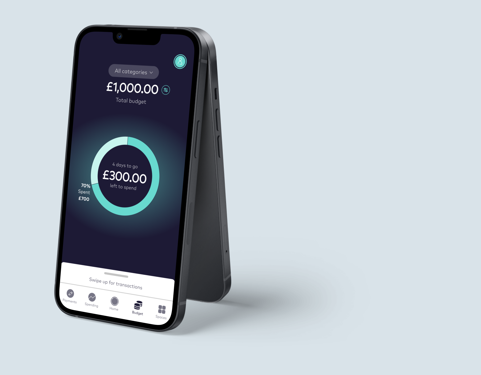
Budget tracking
The chosen navigation structure for this new budgeting feature was carousel dots as this is in line with Starling’s existing UI.
If the user swipes they will then see the category broken down by individual category (if the user sets up category budgets).
In addition the category drop down replicates the UI of switching between different currency accounts so it should be familiar for an existing Starling bank app users.
Create a budget
The create a budget flow is divided into four screens to keep the content clear and minimal on each screen.
First the user must set the budget period by choosing how often it should reset and a start date.
Next they set the overall budget limit, choosing to enter an amount or can opt to see the amount proposed by Starling based on historic activity.
An optional step is to set category specific budgets, where the user can set a limit for one or more categories.
Finally the user chooses if they would like to set up notifications.
Test & iterate
User testing
Remote user testing was conducted using an interactive prototype in Marvel, the tasks for the participant were setup to achieve the following objectives:
Understand if users are able to set up a budget easily
Test if the interaction to access different views and breakdowns of the budget is obvious to the user
Find out if the location of budget settings is intuitive
Affinity map
The feedback from the user testing was synthesised using an affinity map to guide the design decisions on what iterations should be made to improve the new feature of the app.
The user testing revealed the navigation was not clear enough as many users took some time to complete the tasks or didn’t even finish.
The budget settings page also was not easy to locate for the users.
Iterations
Budget settings location
Budget settings were too hidden so they are now accessed via a button with a settings icon next to the budget amount.
This style of button is currently being used on the home screen as a shortcut to access account details, so existing users should be familiar with it.
Budget settings will be kept within the general options page as originally designed but also this shortcut button will be included for easier access.

Navigation
Navigation between the budget home screen and individual category view was not clear.
The swiping interaction was removed, instead the user would click the centre to show total broken down by category and change dropdown selection to go to category view.
A dropdown with ‘all categories’ set as default was added instead of a carousel, so users can clearly see how they would change the to view individual categories.
Additional minor changes
Budget icon replaced to a more noticeable one as it is larger due to not being inside a circle.
‘Set budget’ button changed to ‘create budget’
Moved start date before periodicity and split it out into a separate question to make it clearer
Text moved to below amount and indicates clearly if it is the total budget or a category budget that the user is viewing.
Amount spent now moved to below the percentage spent so it is clearer that this is the amount spent rather than amount remaining to spend.
Next steps
To expand further on this new feature, the next step would be to design the screens for creating a custom category as Starling does not currently have this functionality and it is something the research highlighted as a valuable for the user.
Also additional user testing could be undertaken to validate the changes made in the iterations, to understand if any further changes were necessary to achieve the optimum user experience.


