

The Crooked Cookie
The Crooked Cookie is a small local small business based near London selling homemade cookies. Currently they sell through instagram, an online etsy shop and market stalls at local events.
The problem
The Crooked Cookie are building a customer base and strong reputation through their instagram, however they are missing a website with an online shop to reach a wider customer base and establish their brand identity.
Project details
Create branding and design a website, highlighting The Crooked Cookie’s niche of offering any flavour cookie to differentiate themselves in the already crowded cookie market. Project deliverables:
Branding including logo design
Responsive website with online shop functionality
Design process
-
Research
Competitor analysis and user interviews were conducted to empathise with the target user in order to guide design direction.
-
Ideate
The site structure was mapped out based on the content required. Wireframes were created for the key pages and the brand identity established.
-
Test
An interactive prototype was prepared for user testing which included task scenarios in order to highlight any design issues.
-
Iterate
User testing results were synthesised in order to prioritise iterations before creating the final high fidelity versions ready for development.
Research
Research - Competitor analysis
A variety of different direct and indirect competitors were analysed, including; well known cookie shops, small business cookie sellers, other baked goods such as brownies, cakes etc, cafes, food & beverage companies.
Nice-to-haves
Featured products, specials
Gift options - wrapping, add message
Banner promotions / delivery discounts etc
Search, sort or filter functionality
Newsletter / mailing list sign up
Sustainability information
Key website features
Large appealing hero images of the products
About the company
Customer reviews
Product detail page
Add to cart and checkout flow
Noticeable social media presence
Large product imagery throughout
Ingredients / allergy information, flag for vegan
Weaknesses
No ‘About us’ page doesn’t build confidence in the company
Overly busy with lots of colours and background patterns distracts user from the product itself
Long product lists with no option to search, sort or filter
Large and busy header navigation takes up too much screen space
Research - User interviews
The goals of the user interviews were to gain insight into the target users typical frustrations with online shopping in general, understand their expectations of an online cookie shop and what influences their decision making when choosing where to buy sweet treats.
Key findings
A topic that came up frequently was speed and ease of completing a purchase. Users don’t want to be slowed down by being asked for unnecessary details, particularly when buying a low value item such as cookies.
When purchasing a food product online for the first time the user doesn’t know how it will taste so they rely heavily on imagery and reviews to get a sense of the product.
Those who had purchased from The Crooked Cookie before really liked the personal touch and small business aspect so this is important to convey through the website and brand identity.
The participants
User persona
Feedback from the interviews was collated and used to create a user persona - Katy Roberts.
Katy is keen to support local businesses, and likes to give and receive homemade gifts.
She is frustrated when online shops don’t reflect the product range in-store or has slow delivery times as sometimes she needs to buy last minute gifts!
She likes trying new things but would definitely repeat purchase baked goods if she finds somewhere she really likes.
Ideate
Information architecture
User flow
User flows are an important part of the design process, they focus on the overall experience rather than small design details. A flow represents an overall picture including decision points and provides an opportunity to create a more seamless user experience.
The main website pages are as follows:
Homepage
Shop
About us
Product detail pages
Checkout flow
The key task and reason users will come to the website will be to purchase cookies.
The key decisions are whether they want to buy a box of 6 or 12, and then deciding on a single flavour or a mixed selection.
There are a few shortcuts the user can take to make purchases even quicker, such as logging in to a previously created account to retrieve saved data and paying via Apple pay.
Responsive wireframes
Various options were drawn up for each of the key pages focusing on the points highlighted from the research phase - importance of large product images, company information, social media presence and smooth checkout flow.
-
1) Social media links
2) Cart icon and login button
3) Main navigation just contains two principal pages Shop and About us, clicking the logo would return the user to the homepage
4) Hero image to promote the products, also the main CTA would take the user to the product detail of mixed box as choosing their own flavour is the business’ niche
5) This section would have the top selling boxes (which aren’t mixed) and would direct to the product page when the images are clicked. Clicking ‘Explore all cookies’ would go to the ‘Shop’ page
6) The special section would be used to promote seasonal / limited addition products with a CTA to directly add to cart. Could be a carousel if there were multiple products.
7) Customer reviews carousel with an image and quote
8) Footer section
9) In this version the hero section would be a carousel with a CTA to add the box shown in the image to the cart.
10) This version would show more products on the homepage and have CTA to directly add them to cart without going to the detail page.
-
1) This section would show what events they are appearing at, and could be a carousel if there were multiple upcoming
2) This section would be a snapshot from their instagram page showing product images, reels etc with the button below to go to the instagram page.
3) In this version delivery options are detailed on the About us page and in mobile displayed in an accordion.
-
1) Product images - when clicked they would be directed to the product detail page
2) Here they can select the quantity and add straight to cart without needed to enter the detail page, except for mixed box where they must always go to the detail page in order to select the flavours
3) This would enable the user to send a bespoke request, for example they are looking for something personalised for a gift, which would reach the owner by email.
4) This section would help build trust by displaying customer reviews, encouraging the user to continue with the purchase.
5) In this version there would be no CTA for add to cart on the shop page they would need to click into the detail to be able to choose quantities and add to cart.
-
1) Breadcrumbs to ease navigation to other pages
2) Section of popular flavours to choose from, when the user clicks the plus button it would show quantity added and allow the user to add more of the same flavour.
3) This would be a search and select box, once they have picked a flavour they choose quantity and press add to box. This selection would then appear directly below with the option to remove. They can then search and select another flavour.
4) This dropdown would allow the user to choose between a box of 6 or 12 and the price would update accordingly.
5) This text would appear clickable and once clicked a new box would appear to enable them to input a message.
6) This section would have an image of the cookies already added to the box and a way to remove them. Where no cookies is added a placeholder image/text would be used.
7) The button would be disabled until the relevant number of cookies have been selected.
8) This carousel section would be used to cross promote other cookies.
9) Footer section
-
1) Breadcrumbs to ease navigation to other pages.
2) Here they can select the box size and quantity of boxes the subtotal below would then update accordingly.
3) This text would appear clickable and once clicked a new box would appear to enable them to input a message.
4) This carousel section would be used to cross promote other cookies
5) This accordion section would hide the detail to give a cleaner look to the page.
6) Additional product images would be included here which would become the main image when clicked.
Logo & colour palette
The brand attributes are fun, friendly, inventive and homely - the logo design aims to reflect this with an imperfect cookie incorporated to align with the company tagline.
The colour theme is based around shades of brown to represent cookies, mixed with yellow and green to create a playful palette.
UI Kit
After creating the brand identity, the start of the UI Kit was created, focusing initially on the buttons and icons.
The navigation and input components were created and added to whilst working through the high fidelity screens.
High fidelity mock ups
Home
Once the branding and colours were defined, the high fidelity mockups were created based on the initial wireframes.
The aim was to bring out the brand attributes, making the website friendly and inviting to visitors, keeping in line with the homely small business feel.
The home page focuses on showcasing the products through the large hero image and grid of bestsellers.
There are clear CTAs to encourage users to shop and make purchases to help drive sales for the business.
Shop
The user can shop by selecting a single flavour and box size, or selecting a mixed box and choosing the individual flavours.
A high proportion of potential users shop on their mobile, therefore a responsive website is critical for The Crooked Cookie.
In the small screen size designs the content is stacked, keeping the images large enough to attract attention but not take over the whole viewport.
Add to cart
When adding a product to their cart the user has clear options to go to checkout or continue shopping
They can also clearly see what has been added to their cart and the cost.
At this stage they can also remove the item from their cart by clicking the delete icon.
Checkout
Once the user proceeds to the checkout they have 3 steps to complete, clearly outlined by the progress bar at the top of the page.
They are able to log in to retrieve saved personal and address details, but can also checkout as a guest.
The delivery step provides an option to send items to different addresses, for example if they are buying gifts.
Payment details is the final step, both card payment and Paypal are accepted methods. Once this stage is completed the purchase is made.
A confirmation screen acknowledges the order is complete and advises the user when to expect delivery.
Test
User testing
Remote user testing was conducted using Maze with the following objectives:
Understand how easily users are able to buy a box of cookies all of the same flavour
Validate if the checkout flow is easy to follow and makes sense to the users
Find out if the company’s brand is being well portrayed through the website
Results of user testing were synthesised using an affinity map in order to identify and prioritise iterations.
Iterations
Based on the feedback from the user testing the following 3 iterations were prioritised in order to improve the user experience:
Filter
A filter with search & select functionality was added to the Shop page in order to see full product list and ease navigation.
This is an important change particularly as the business grows to offer more flavours and product variations. Users want to be able to quickly locate their preferred product and make a purchase.
Shop - All cookies
Options to add to cart for each cookie on the Shop page were removed to make the page cleaner and easier to follow.
This change avoids too many distractions allowing the user to focus on the flavours and make a choice of which to buy.
CTA fixed when scrolling
Add to cart on product detail page was changed to a section at the bottom of the page that is fixed when scrolling.
This is an important enhancement to help drive more purchases, if the CTA of add to cart is not easy to locate users may lose interest and not complete the purchase.
Next steps
Before handing off to the developer to build the website, the following would need to be completed:
Create sign up flow and area for logged in users
Receive images from the business owner for each of the different flavours
Update copy for ‘about us’ page
View more projects

Equalize
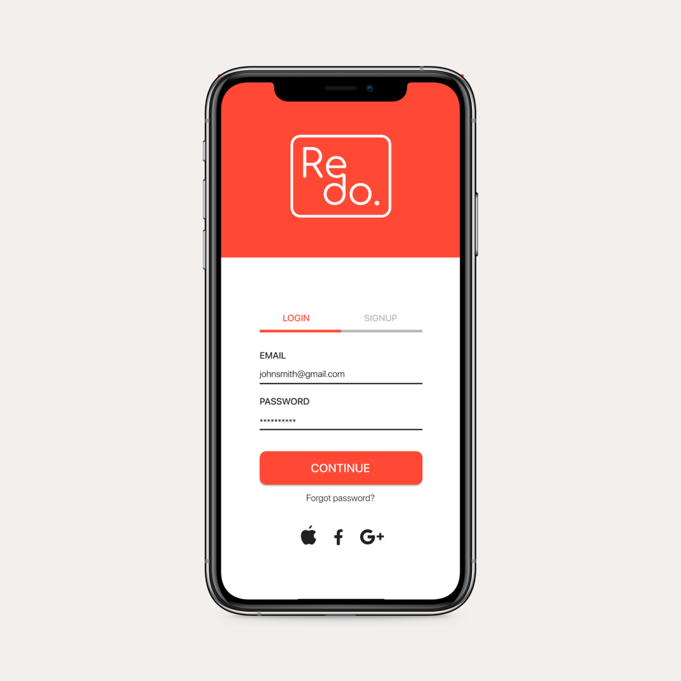
Redo

Starling